7.9 KiB
Dialog
The Dialog is a component that is rendered over the page with an overlay. It is used to show messages or actions when user's attention is needed.
Usage (props)
The options prop allows you set a number of options for a standard Dialog
layout.
<template>
  <Button @click="showDialog = true">Show Dialog</Button>
  <Dialog
    :options="{
      title: 'Update Role',
      message: 'Are you sure want to update this role?',
      icon: {
        name: 'alert-triangle',
        appearance: 'warning',
      },
      size: 'sm',
      actions: [
        {
          label: 'Confirm',
          appearance: 'primary',
          handler: ({ close }) => {
            // updateRole()
            close() // closes dialog
          },
        },
        { label: 'Cancel' },
      ],
    }"
    v-model="showDialog"
  />
</template>

<script setup>
import { ref } from 'vue'
import { Dialog, Button } from 'jingrow-ui'
let showDialog = ref(false)
</script>
Props
There is only one prop option which is an Object. Each of the properties of
this object is described in the table below.
| Name | Default | Value | Description |
|---|---|---|---|
options.title |
Untitled |
String |
Title of the dialog |
options.message |
null |
String |
Message shown in the body of the dialog |
options.icon |
String | Object |
FeatherIcon name or Object{name, appearance} |
Icon shown to the left of title |
options.icon.name |
String |
FeatherIcon name | |
options.icon.appearance |
null |
warning | info | danger | success |
Changes the color of icon |
options.size |
'lg' |
xs | sm | md | lg | xl | 2xl | 3xl | 4xl | 5xl | 6xl | 7xl |
Change the width of the dialog |
options.actions |
null |
Array of Button props | Each object in the array must be an object of props passed to a Button component. Click handler is set via handler property. |
Usage (slots)
If you want to take control over the markup of each part of the dialog, you can use slots. The Dialog components is made up of nested slots which allows you to override a part in a granular way.
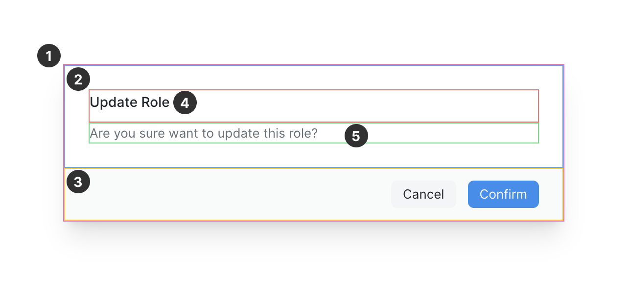
Here are the slot names corresponding to the marked region in the above screenshot:
| Number | Name | Description |
|---|---|---|
| 1 | body |
Override the full body of the dialog |
| 2 | body-main |
Override the main content |
| 3 | actions |
Override the actions |
| 4 | body-title |
Override the title |
| 5 | body-content |
Override the message |
In the following example, the slots body-title and body-content are used.
Notice that we can still use options.actions to show our action buttons.
My custom title
Irure Lorem culpa nulla fugiat nulla labore aliquip exercitation laboris ex qui. Aliquip pariatur esse amet laboris. Veniam ullamco dolore incididunt consequat commodo id consectetur labore et. Eiusmod esse laborum irure aliquip laboris sunt dolore voluptate sint ea mollit do Lorem. Sit aute dolore aliqua id Lorem amet eu anim pariatur nostrud quis ut. Officia in aliquip minim id esse do. Magna in enim commodo tempor nisi voluptate cupidatat reprehenderit.
<template>
  <Button @click="slotsDialog = true">Show Dialog</Button>
  <Dialog
    :options="{
      actions: [
        { label: 'Destroy', appearance: 'danger' },
        { label: 'Cancel' },
      ],
    }"
    v-model="slotsDialog"
  >
    <template #body-title>
      <h2 class="text-3xl font-bold">My custom title</h2>
    </template>
    <template #body-content>
      <p class="mt-4 text-lg">
        Irure Lorem culpa nulla fugiat nulla labore aliquip exercitation laboris
        ex qui. Aliquip pariatur esse amet laboris. Veniam ullamco dolore
        incididunt consequat commodo id consectetur labore et. Eiusmod esse
        laborum irure aliquip laboris sunt dolore voluptate sint ea mollit do
        Lorem. Sit aute dolore aliqua id Lorem amet eu anim pariatur nostrud
        quis ut. Officia in aliquip minim id esse do. Magna in enim commodo
        tempor nisi voluptate cupidatat reprehenderit.
      </p>
    </template>
  </Dialog>
</template>
In the following example, we have used the body slot. This is top-most slot
and overrides everything. Use it for fully custom dialog layouts.
<template>
  <Button @click="bodyDialog = true">Show Dialog</Button>
  <Dialog v-model="bodyDialog">
    <template #body>
      <div
        class="flex items-center justify-between border-t p-2"
        v-for="i in 4"
        :key="i"
      >
        <span>Item {{ i }}</span>
        <Button icon="x" />
      </div>
    </template>
  </Dialog>
</template>